Headers have long been a part of web design, and they are incredibly important. If the front door of a house is the first impression of someone’s home and the profile picture of someone on Tinder is the first impression you get of a prospective partner, the header of your website provides the opening thoughts to people of a website or brand.
For those websites that have them, therefore it’s integral that they are right, and with more and more people creating websites, the more and more people are actually getting them wrong. It’s easier to make a website than ever before, with dozens of platforms available. Every 17 seconds a new website is created on Duda, for example. But while these website builder brands can help you get your template perfect, they aren’t responsible for the images you are choosing.
So, how do you create the perfect header image?
Be Inspired By Your Branding

It should go without saying that your header image stays on brand with the rest of your site. But some people do go off-piste and choose something a little more “out there”. If that doesn’t represent what you are as a brand, though, then you’re in trouble.
Think about the rest of your site’s design and how you can best pair your header image up with that, so there’s smooth transition in the scroll and the colors complement each other.
Think about the Impression You’re Making
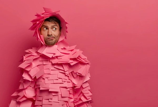
As we’ve already mentioned, the header of your site is the first impression many will get of your business or site, so it’s the perfect opportunity for you to make a good one.
Think about your brand values and the messages you want to get across. What can you say to make people trust you and buy into your business? It’s one of a number of ways in which you can make a first impression as a business so choose an image that strengthens your position in the market. If you’re a brand that is proud of its equality, use imagery that reflects that.
Keep it Clean
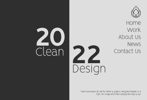
But whatever messages you want to get across, ensure that the design is kept clean and tidy. A cluttered header can have a negative impact on a business, and leave impressions of an unorganized business.
Most businesses do opt for either a graphic designed header or a high-res image, and that’s largely the way to go. Images should be clear and focus in on one element, which should provide your core brand messages, while graphics can offer a more subtle approach, using shapes and colours to convey particular messages. They should not be overwhelming though, while animation can take them to the next level. Again, subtlety is key.
Size it Right
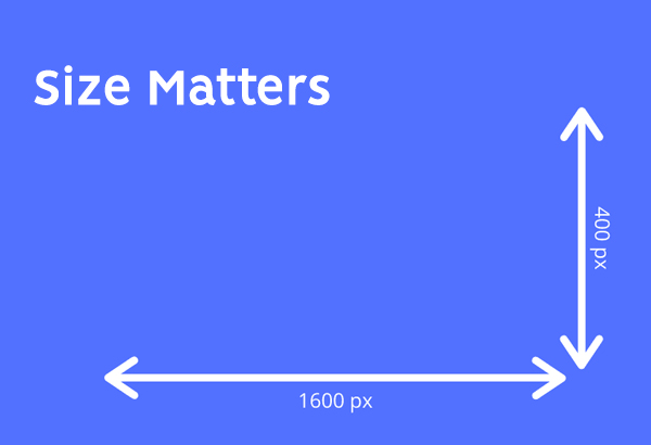
It’s the biggest faux pas in web design. Or at least one of. If you are going to have a header on your website, make sure the image is the right size. You don’t want your header to be out of focus, distorted or require cropping. This is not a good look.
Also, you need to think about how your header may look on both desktop and mobile, and ensure that the header reacts responsively to the screen size.
Consider Text
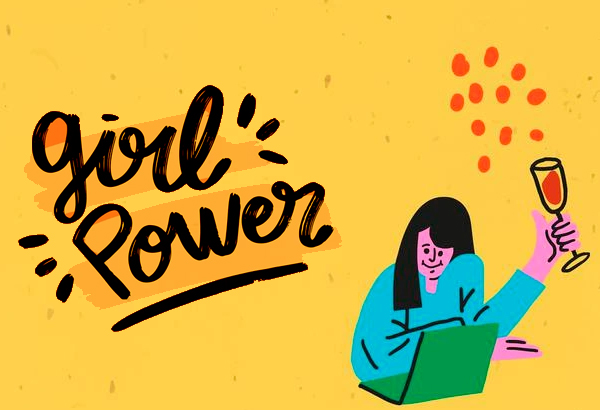
While the imagery will do much of the talking on a header, you can use text to emphasize a point or add another. Text can really strengthen who you are as a brand, although you need to keep it brief, light and powerful.
Taglines are the most efficient way to do this. You may even already have one for your business, so there’s nothing wrong with dropping that into your header to really maximize the output of what you want to leave with your reader as a first impression.
 The post How to Create the Perfect Header Images for Your Site first appeared on Graphic Design Junction.


0 Comments